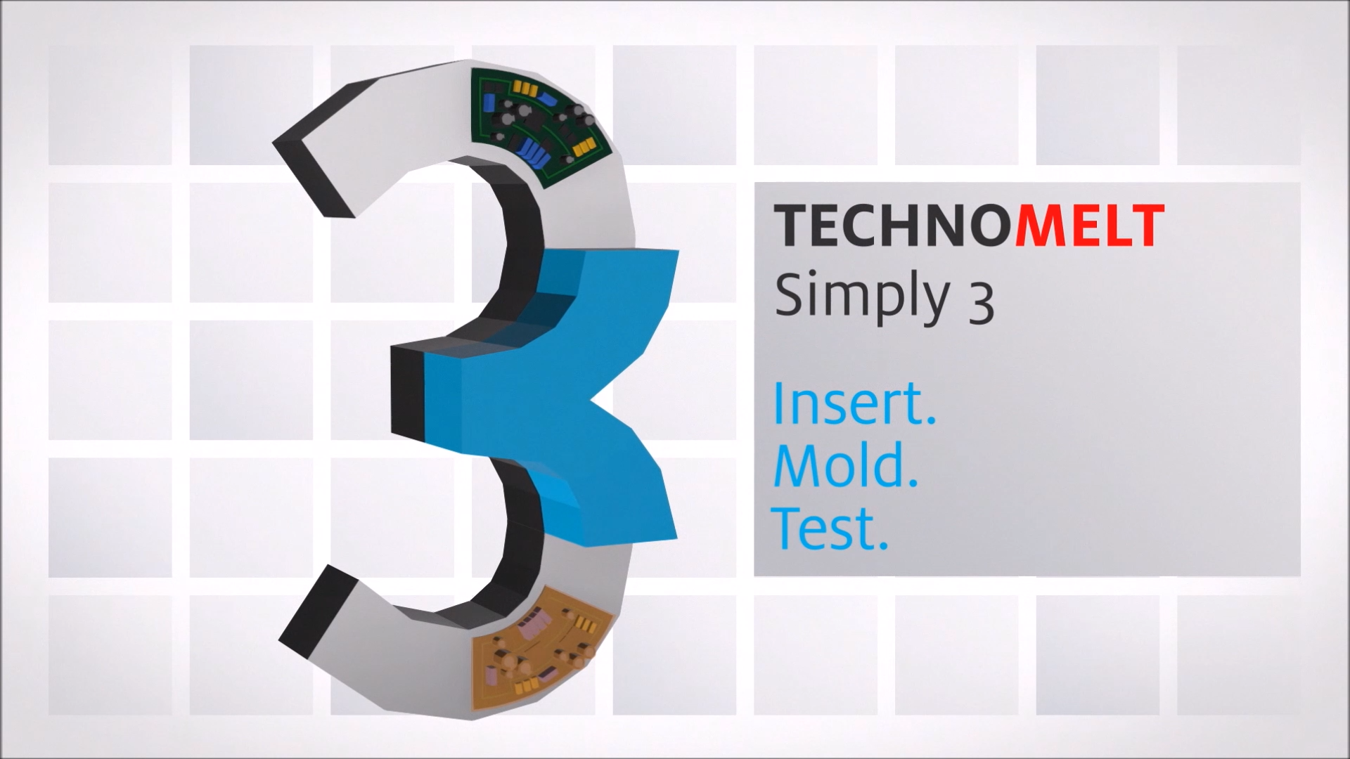
Check out this video from Henkel about how and why you should use TECHNOMELT
Interested in this product?
TECHNOMELT is available through our online store, as a 20KG bag option. If that isn’t the right version for you, don’t fret, enquire below!
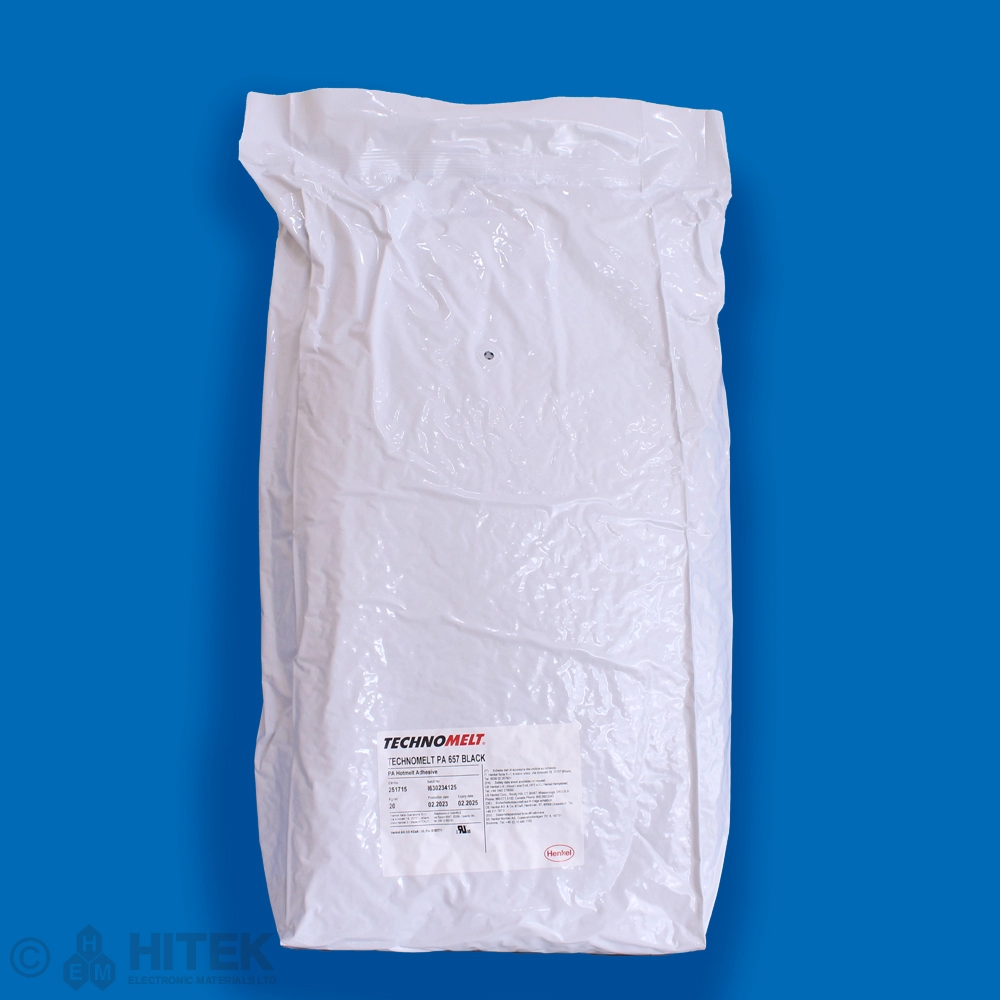

Check out this video from Henkel about how and why you should use TECHNOMELT
TECHNOMELT is available through our online store, as a 20KG bag option. If that isn’t the right version for you, don’t fret, enquire below!


Take a look below at a case study from Henkel about how they utilised BERGQUIST LIQUI-FORM TLF 6000HG as a 5g solution.

Struggling to understand the Acronyms used on or around Henkel products? Take a look at the table below for a list of different acronyms alongside an explanation as to what they mean.
| Acronym | Explanation |
|---|---|
| ABP | Ablestik ABP stands for “Advanced Bonding Paste.” This type of adhesive is designed for high-performance die-attach applications, offering excellent thermal and electrical conductivity. |
| (BE) | Made in Belgium, dropped in favour of W1 during renaming in 2012-15. |
| CA | Ablestik CA = Conductive Adhesive. |
| CE | Ablestik CE = Conductive Epoxy. |
| CTE | Coefficient of Thermal Expansion – measures how much a material changes in size due to temperature changes. |
| ECF | Ablestik ECF = Electrically Conductive Film. |
| FT | The “FT” in Stycast 2850FT stands for “Filled thermally.” |
| GT | The “GT” in Stycast 2850GT stands for “Gritty Thermally conductive.” It contains hard and gritty fillers that enhance its thermal conductivity and mechanical properties. |
| ICP | The “ICP” in Ablestik ICP stands for “Isotropic Conductive Paste.” This type of adhesive provides electrical conductivity in all directions, making it suitable for applications such as surface-mount technology (SMT) assembly and die-attach processes. |
| KT | The “KT” in Stycast 2850KT stands for “Kool Thermally conductive.” This product is a two- component, room temperature curing epoxy encapsulant designed for high-voltage components and replacing heat sinks. |
| LMI | Ablestik 84-1 LMI stands for “Low Mobile Ion,” indicating that the adhesive is designed to minimize the presence of mobile ions, which can be crucial for maintaining the reliability and performance of electronic components. |
| MM | This indicates that the product is designed to be used with meter/mix dispensing equipment. |
| MT | The “MT” in Stycast 2850MT stands for “Medium Thermally conductive. |
| PC | The “PC” in Stycast PC stands for “Printed Circuit.” This indicates that the product is designed for use with printed circuit boards (PCBs), providing environmental and mechanical protection through conformal coatings. |
| QMI | The “QMI” in Ablestik QMI stands for “Quartz Micro-Insulated.” This indicates that the adhesive is designed with quartz fillers to provide excellent thermal and electrical conductivity. |
| SI | Stycast 1090 SI stands for “Syntactic Insulating.” This product is a lightweight syntactic encapsulant designed for applications where high compressive stress is applied to encapsulated circuitry, such as in deep ocean work. |
| W1 | The first formulation of this product to be made in Westerlo, Belgium. Mainly used in the European markets. This arises from REACH and RoHS regulations which meant Henkel had to reformulate some materials made elsewhere (USA/Asia) to prevent them from being excluded in Europe. |
| WLV | This stands for “Wafer Level Version,” indicating that the adhesive is optimized for wafer- level applications. |
Tis the season of joy, whether you celebrate it or not, we would like to extend a happy holidays to all as HITEK closes for the rest of the year. We look forward to seeing/talking you all in the new year.
Merry Christmas and a Happy New Year from everyone at HITEK!
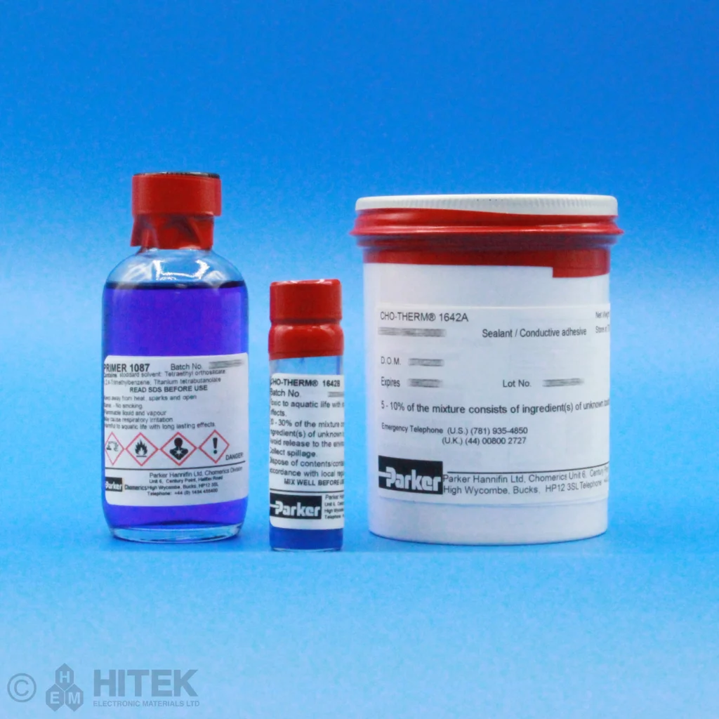
Todays #ProductSpotlight focuses in on Cho-Therm 1642 and Primer 1087 (277g Kit)!
Cho-Therm 1642 is a two-part thermally conductive sealant. Combining the features of Ceramics and silicone. This product doesn’t require water vapour to cure. The material has a mix ratio of 100:3 which is decided by their weight. Combining the two-part Cho-Therm 1642 with Primer 1087 allows for a permanent bond to be formed.
Features and Benefits:
#Chomerics #Adhesive #protectingyourelectronics
Missed any of our #ProductSpotlights this year?
Don’t fret, we have you covered. Visit the webpage below to find all the products we have been raving about this year. From Adhesives to Yarn, we’ve aimed to provide you with a wide variety of products from our suppliers this year. With the last shipping date closing in fast for this year we want to thank all our suppliers for the products we are able to offer, to #protectyourelectronics.
Take a look at our collection here – https://www.hitek-ltd.co.uk/category/updates/product-spotlight/
#Chomerics #Henkel #Permabond #Shieldex #ABSTechnics #HITEK-nologySolutions #Orbel #Cortec
With the festive season upon us, HITEK will be closing for the year on the 24th of December. That being said our last shipping date will be 20th December 2024. If you do plan to order from us then ideally do so before 11am so that your orders can be processed and shipped on that day. Any orders after 12pm will not be processed and you probably wont receive your items till the new year.
We hope you understand and have a great festive season.
#protectingyourelectronics #Christmas #LastShippingDate
Todays #BrandSpotlight focuses on our partner for EMI Shielding fabrics and yarns, @Shieldex
With a broad range of products available, Shieldex offer products that aim to prevent EMI Interference. While we do offer yarns and fabrics online we also have the capability as their UK distributor to offer some of their shielded enclosure solutions.
Check out their brand page here to see exactly what they offer: https://www.hitek-ltd.co.uk/shop/shop-by-brand/shieldex/
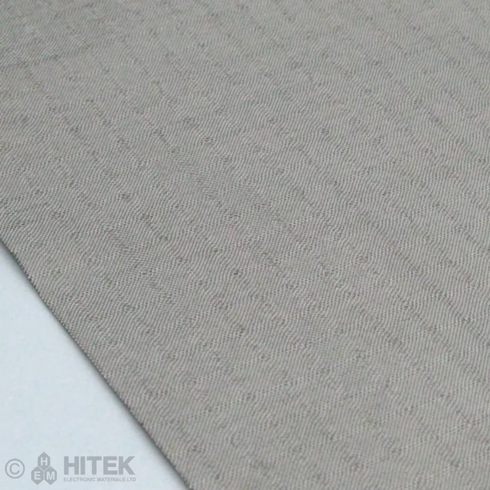
Today’s #ProductSpotlight is on @Shieldex Nora Dell.
A woven solution from Shieldex, this fabric offers a high level of thermal and electrical conductivity. Available as 500 x650mm or 1000x1300mm sizing this product provides shielding up to 56db in a 26-40 GHz frequency range. typically this product is used for most if not all technical situations that require high conductivity and shielding.
#Shieldex #Fabric #protectingyourelectronics
Today’s #ProductSpotlight focuses on @Henkel Bergquist Gap Pad TGP HC3000!
BERGQUIST GAP PAD TGP HC3000 is a gap filling material specifically designed for applications where components need a gentle touch. This soft and compliant material easily fills gaps and conforms to uneven surfaces, all while delivering impressive thermal performance (3.0 W/m-K).
Features and Benefits:
#ChannelPartners #ThermalManagement #protectingyourelectronics