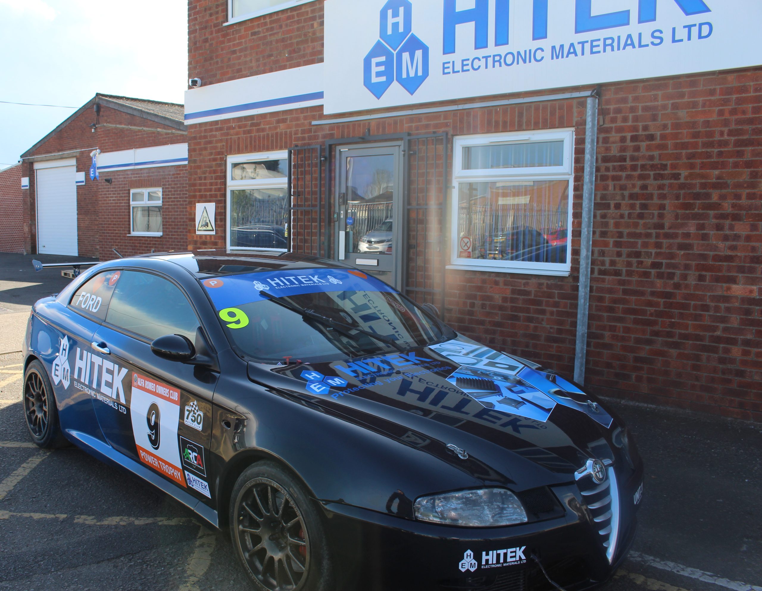
As Headline sponsors of the Alfa Romeo Championship we take pride in the fact our logo appears on the drivers cars. But for our Finance Director Richard Ford, he has taken it a step further. HITEK’s Marketing team, took a brief of “HITEK-ify my racing car for the upcoming season” using their brand guidelines and identifying a few core elements that needed to be on the design.
- The Logo
Arguably the most important part of HITEK’s branding is their the logo, while present on all the cars, bringing it to the forefront of a HITEK car was key.
- The Colours

From our signature blues to the differing shades we had to consider what would stand out on a race track whatever the weather.
- Our new look leaflets

Our new and improved leaflets, bring the hex shape to the forefront while also showcasing some of the core business.
The Initial Design
When designing artwork for a car the first major thing to consider was its shape and size.
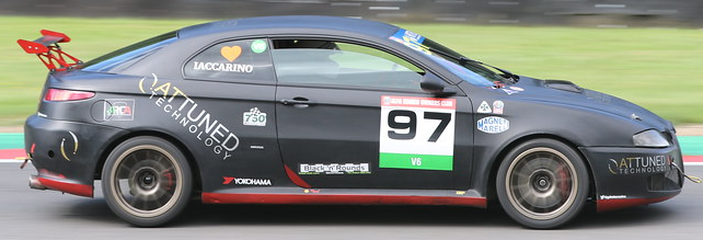
Given the sporty design and lower roof, there’s limited space for overloaded content. Therefore, a clean and minimal approach was necessary.
Secondly the curvature of the car played a major factor into the design as the shape of the bonnet and sides affected the possible placements of artwork as well as their shapes.
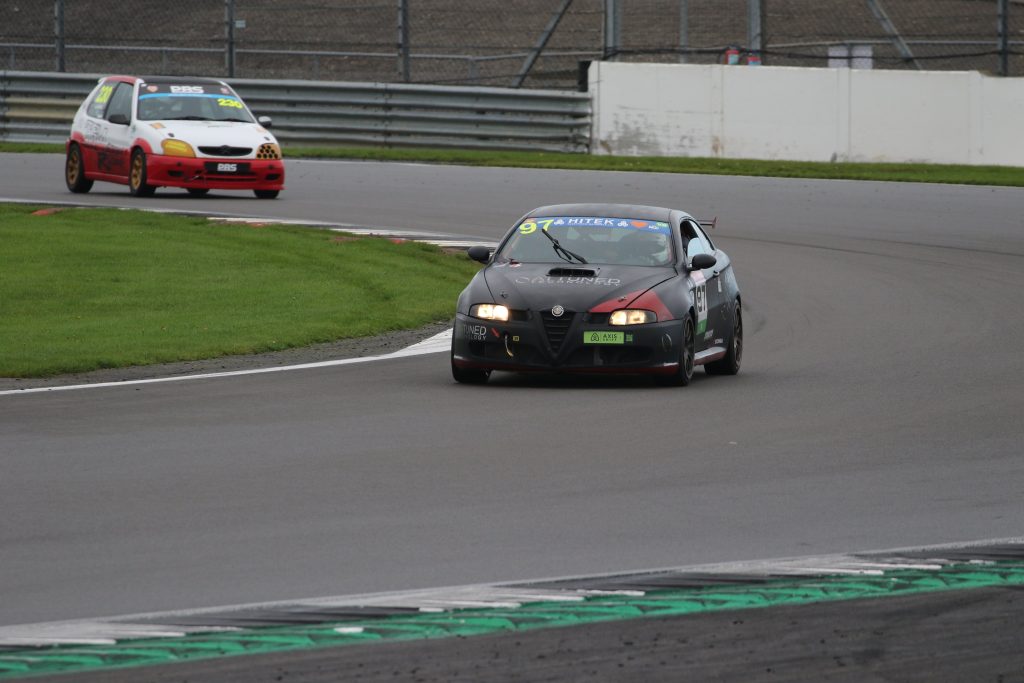
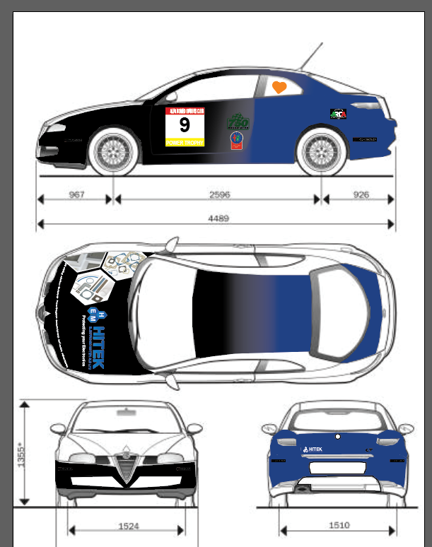
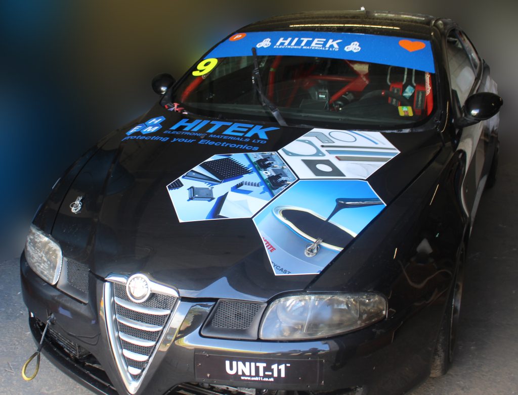
With those things considered it was time to look at colours. As you can see from the images above the car was in a shade of black prior to our designs. As black is a part of our colour schemes for varying aspects of our branding, we felt it was fine to incorporate it into the designs.
This however, wasn’t the only colour we needed to consider, as the signature HITEK blues needed to be implemented in the design.
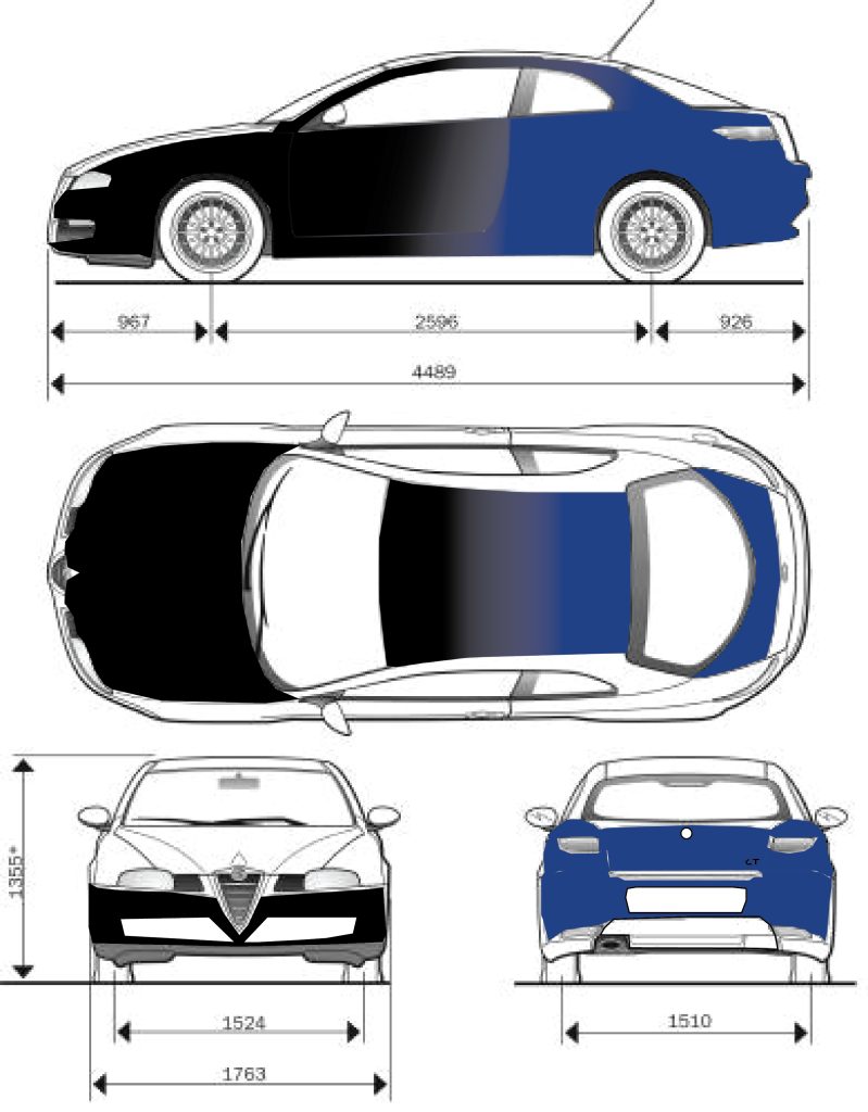
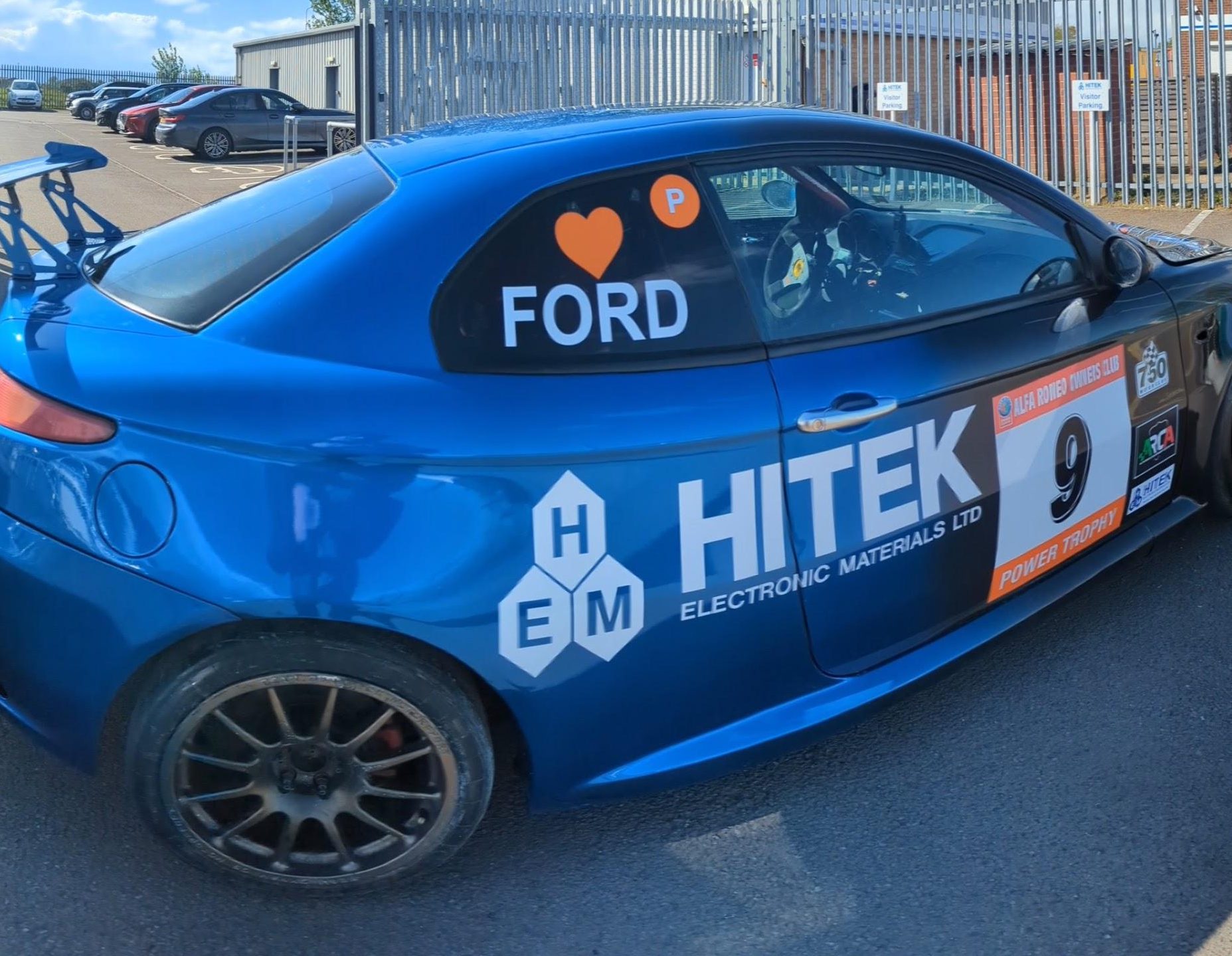
We felt it was best to go for a blended approach with the gradient shifting to our dark blue the further down the car you go.
This colour layout allowed for an ease of transition between the base frontal colour that allows for graphics to stand out, to a more HITEK theme in the rear.
With the base colour setup in place it was time to start thinking about graphics.
This was the most intricate part of the design, with the base colours laid out we needed to consider something that would stand out on the car.
The many different graphic design choices
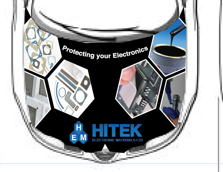
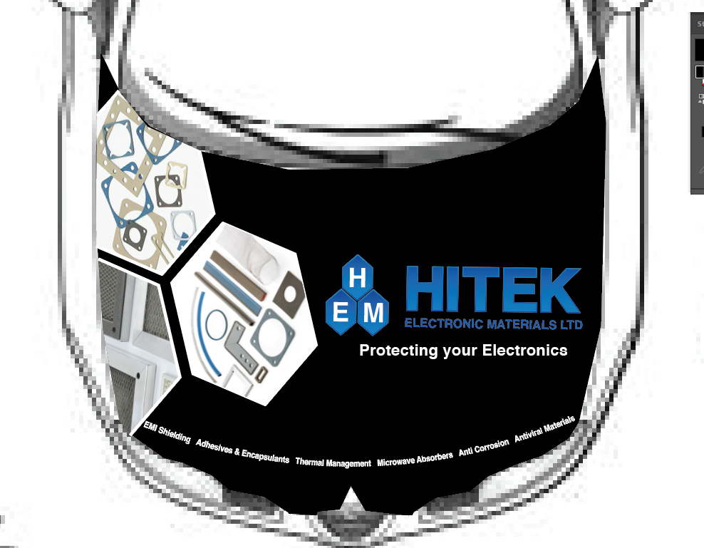
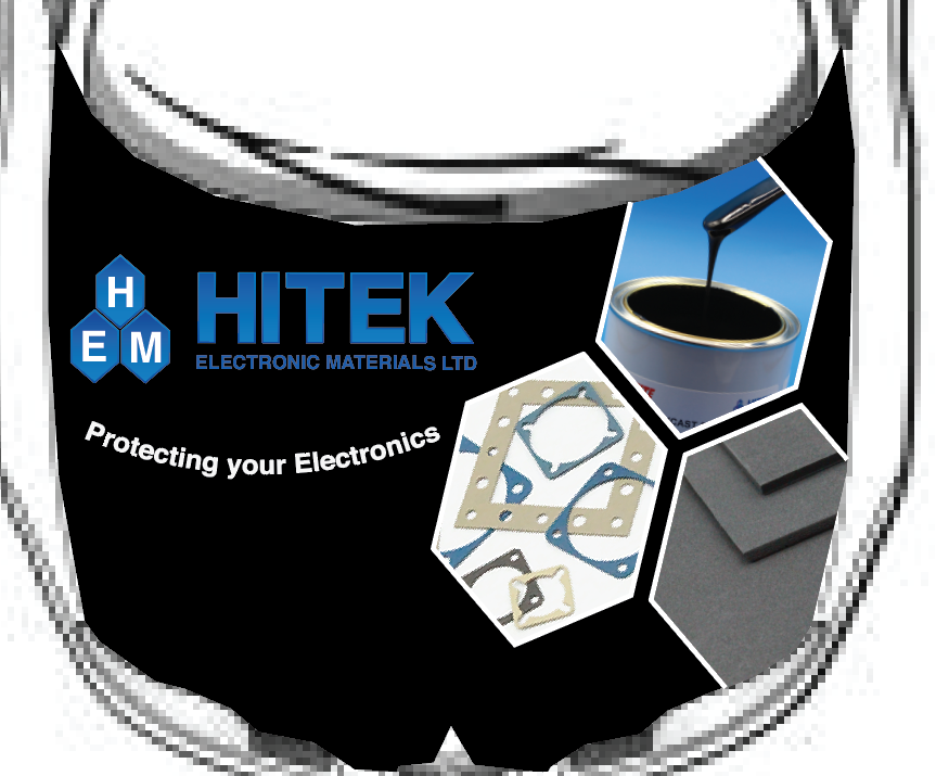
Many mock ups of how the graphics would sit on the car were discussed and created along the way, the bonnet being the hardest aspect of the car design due to multiple alterations to find something that would fit in with the branding, represent the company offering and also stand out on the race track.
As the designs evolved more and more focus on the bonnet was done, as soon enough all the drafts became just bonnet designs.
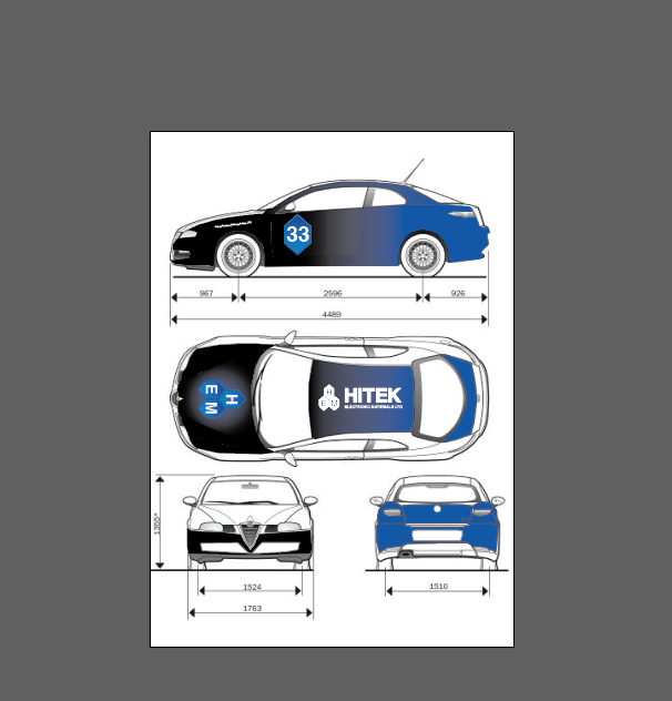
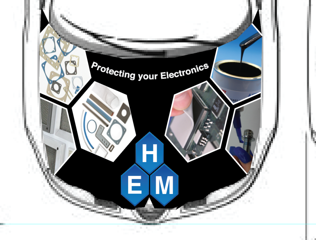
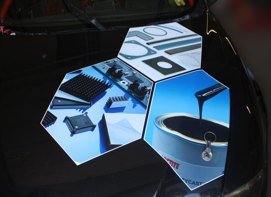
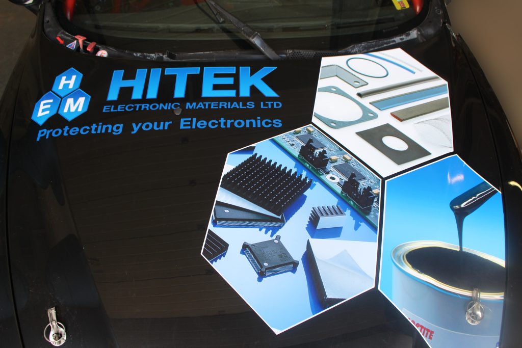
So, in the end what we found best to include on the front was the logo, the trio of hexagons from the latest branded material.
From digital designers to real life appliers
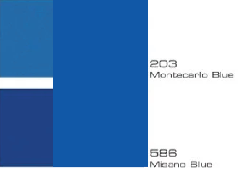
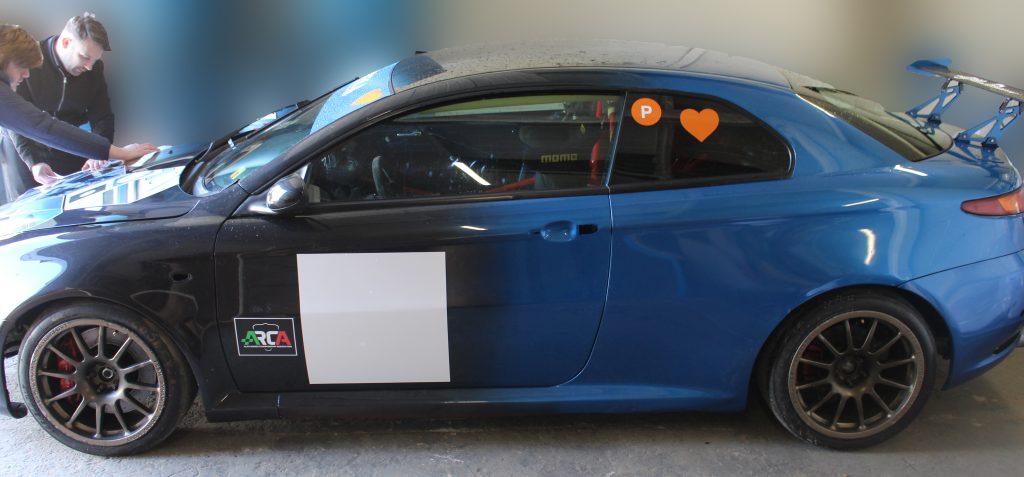
With a design chosen it was time to execute the excellence of the design in real life. Firstly came the gradient. one thing we realised was that getting the exact colour scheme we have is very tricky. Plus, if the car got damaged. replacing parts would be so much harder. Which meant we had to compromise on the blues.
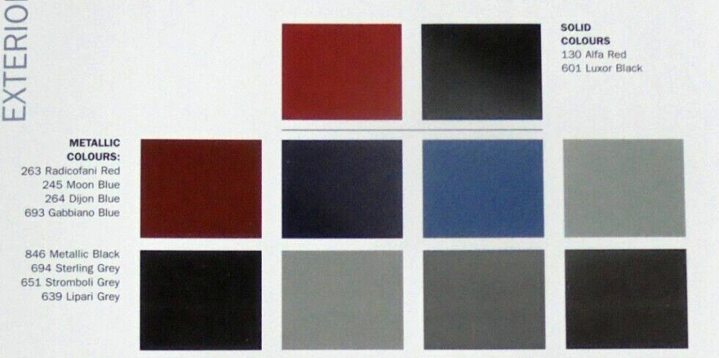
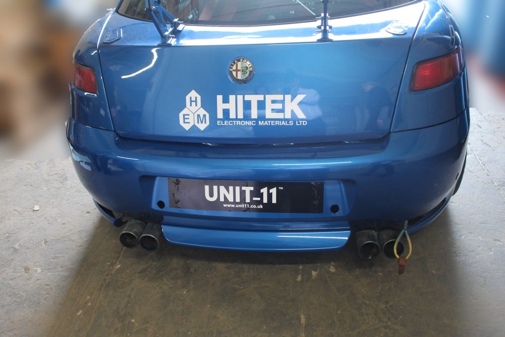
After diving into the Alfa GT colour charts, what was decided on was the Montecarlo blue as it was more so the middle stage between our light and middle blues.
This allowed for replacement parts from a standard GT to be used in case of severe body damage.
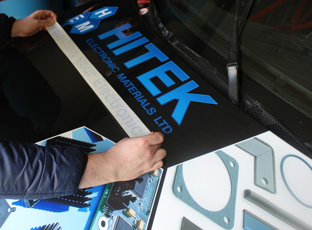
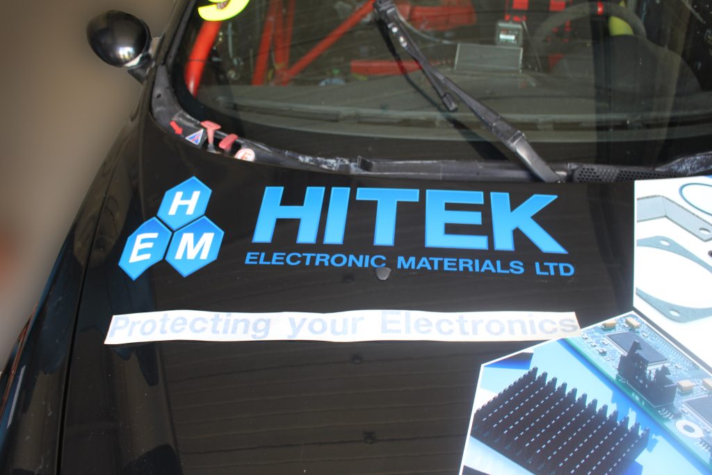
Next it was time to apply the graphics to the car. As mentioned before the bonnet was the most contentious part of the design so nailing the execution was key if we were to be happy.
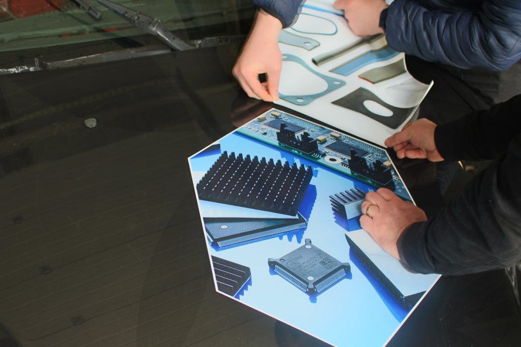
As such we started with the trio of Hexagons. What we realised when it came to these was that getting the first one down perfect was the most important aspect, this would allow for the other to to be placed evenly and in line to create that perfectly spaced masterpiece.
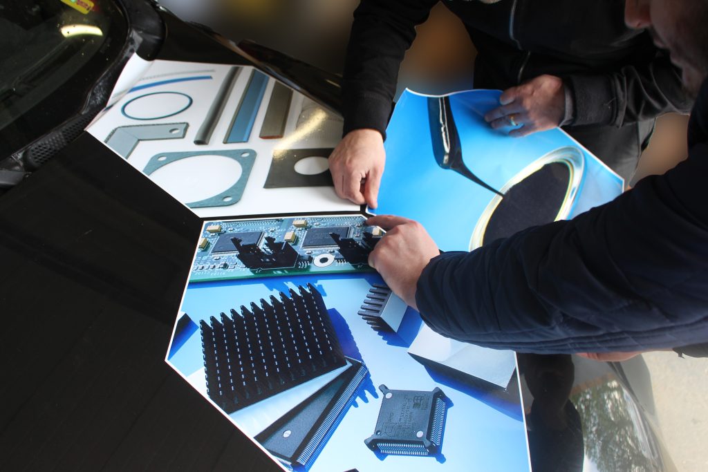
Lastly for the planned graphics it was the logo and HITEK tagline. With how we placed that first hexagon, it enabled us to line up the logo and slogan so that it would fit neatly along the top of the bonnet.
The surprise twist in the execution
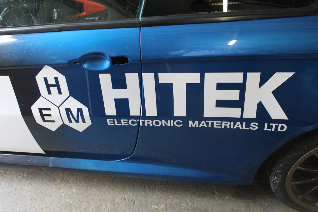
Not everything about the design stayed the same when it came to the execution as a larger sized logo was added to the side of the car. This addition was to help broaden how our brand was seen as the pure white logo across the blend tied the design in well.
The Final Look
While we’ve been teasing the design through out this article it is finally time to showcase it to you.
From just a small idea from someone, to a fully fledged car design, many different people haveworked together to get this concept from idea to the final piece. As such a massive thankyou to all contributors who helped.
To get a good in person look at the car in action, the first race of the season at Croft is happening the 20th and 21st of April. Take a look at the race preview here.
